What does the HDTV captioning spec say about typography?
This activity now has a legitimate copy of CEA-708-C, “Digital Television (DTV) Closed Captioning.” It is a 102-page document with abysmal copy-editing and atrocious graphic design and typography (“typeset” in Arial, among other abominations). At $200 a copy including shipping, the spec is approximately 200 times overpriced for the actual quality of workmanship. Even the admonition not to violate copyright is incorrect, screaming DON”T VIOLATE THE LAW!
Irrespective of such admonition, this activity has expansive user rights for fair dealing under the Copyright Act in the context of review and criticism. What does specification 708 really say about type?
Components
708 breaks up the task of displaying captions into five components:
- Caption screen (the entire screen or “canvas”)
-
Broken up into a grid of 210 × 75 cells in 16:9 aspect ratio and 160 × 75 cells in 4:3 aspect ratio. The upper left corner of the screen has coördinates
(0,0). All the grid cells fall into a standardized safe-title area. In resolution terms, then, HDTV screen layout has only 15,750 or 12,000 “pixels.” That isn’t very many pixels for a “high”-definition picture. (We will see another example of a de facto coarse resolution later.) - Caption windows (blocks or regions of actual caption display)
- It is implied but not stated that caption windows may be positioned solely within the grid of the caption screen. It’s also implied that the origin point of any window is the upper left corner of a grid square. You’ve got eight windows at a time to play with, and zero to eight of them may be displayed at any one time. And each window has nine points (four corners, centre, middle of each edge) from which to anchor text. When text size changes (i.e., if the use picks a bigger or smaller font), text grows or shrinks from the designated anchor point.
- Caption pens
- Typographic attributes: “the size, font, colours, and styles of the text within a window.” There are only 64 available colours, in RGB notation from
(0,0,0)to(3,3,3). - Caption text
- Caption text occupies space within a window. The spec contradicts itself on whether or not it is possible for text to extend past the right-hand and bottom margins (in assumed left-to-right/top-to-bottom text flow). Presumably the latter such declaration is the one that is actually intended (“[c]aption text designated for the window may not exceed the boundaries of the window” irrespective of font attributes or size).
- Caption synchronization
Window size
Apart from the restrictions noted above, it turns out that there is one feature that 708 does not improve compared to old analogue (608) captioning: The number of possible rows and columns, which are identical to 608 captioning (32 rows by 15 columns). While this was presumably specified for backward compatibility with analogue captions (“some legacy decoders may not be able to display more than 12 rows”), it again subdivides a “high”-definition image into a tiny number of effective pixels (480).
An HDTV receiver has to calculate the size of a window by multiplying the font size (“the physical height of the tallest character... to include line spacing”) by the number of rows. That makes sense. But to calculate width, the receiver has to multiply the width of the widest character in the font by the number of columns required. In essence, a line consisting of the word “Illinois” is sized as though it consisted of “WWWWWWWW” (or, if the device did a really thorough job, “ŒŒŒŒŒŒŒŒ” or “‱‱‱‱‱‱‱‱” or “————————” [em dashes]).
The spec also contradicts itself on the issue of keeping the window within the safe-title area. “[A] decoder may be required to modify a displayed window [so] it grows beyond the safe-title area,” but if any such changes exceed the safe-title area, “the decoder may modify any pen attribute of any characters in the window to make the window fit.” This is a recipe for disaster, as it empowers the receiver to show all but the last two characters in a line in one font and style and revert to something else for the last two. The spec spends several paragraphs explaining that the intent is always to show an intact caption, but that is not the only option permitted under the given wording.
The spec even mentions scenarios that cannot be handled properly, like a full row of large characters on a 4:3 screen, in which case the window could be “disregard[ed].” 708’s requirements for window display are contradictory and simply have not been thought through enough.
Justification and print direction
The spec attempts to handle the issue of left/right/centred/full justification for multiple languages and writing directions and rather confuses the issue. It at least accounts for all eight variations of left/right character direction and top/bottom block direction (confusingly termed “scroll direction”; captions do not all scroll). It is at least nominally possible to typeset Mongolian or Ogham in 708.
The spec also claims that it “does not define how a decoder should treat existing text in [a] window upon a change of print direction,” then gives three paragraphs defining exactly that. It is still not clear what a decoder should do if it receives, say, a full line of English, a half-line of English, two words of Hebrew, a quarter-line of English, and a full line of English all destined for the same window. (The same applies to a discussion of changing the scroll direction within a window.)
It is not obvious why the definitive standard for HDTV captioning has to give an entire paragraph of instructions on how to create a ticker-tape effect. Viewers want captions, not stock quotes.
Font size
Only three caption sizes are defined:
- Standard fonts are no taller than 1/15 the safe-title area and no wider than 1/42 the width (16:9 aspect ratio) or 1/32 the width (4:3 aspect ratio).
- Large fonts may be no wider than 1/32 of the safe-title area (16:9 aspect ratio only – 4:3 is not mentioned even though it is an environment where impossible display cases were already mentioned). Large fonts must also be no larger than 42/32 the width or height of standard sizes.
- Small fonts are defined only as being no smaller than 32/42 times the width or height of standard fonts.
None of those figures include line spacing despite the fact that receiver manufacturers are obliged to include it when calculating window size. Character-width limits may be unrealistic and could be ignored by type designers, who know better in the first place. If small and large font dimensions “are at the discretion of decoder manufacturers,” then surely they are also at the discretion of actual experts.
For aspect ratios other than 16:9 and 4:3, the instructions are flatly incomprehensible.
The spec provides a table of recommended dimensions for characters in monospaced fonts under certain display sizes. The table is not really usable by or relevant to a type designer.
Font styles
While it is known that 708 defines “eight” font styles (really 6½), the exact wording in the actual spec is rather surprising.
0: “Default (undefined),” hence not really a font style1: Monospaced serif (e.g., Courier, an unsuitable font for captioning)2: Proportional serif (e.g., Times New Roman, also unsuitable)3: Monospaced sansserif (e.g., Helvetica Monospaced [sic])4: Proportional sansserif (e.g., Arial or Swiss [again sic])5: Casual (“similar to Dom and Impress”)6: Cursive (“similar to Coronet and Marigold”)7: Small capitals (“similar to Engravers Gothic”), but not actually a font style; small caps can be applied to any typeface category, including cursive (Cf. Zapf Chancery)
But all of those font styles are optional in decoders.
The entire range of “pen styles” includes italics and underlining – and nothing else. Superscript and subscript are separately available, but of course the spec does not tell us whether or not drawn superscript or subscript characters are necessary, or what proportion to scale regular characters, or how high up or low down to place them, or what to do about linespacing.
Bounding boxes
The spec is contradictory on the topic of the bounding boxes in which each character sits. Foreground and background colours can be individually altered, but we are advised not to do that too often within a word, as “it can cause unwanted interactions with window background colours and with italic and cursive fonts [and] may interfere with kerning.” Essentially, the spec contemplates character forms that extend beyond their bounding boxes; those parts then may or may not be governed by the colour settings of the adjacent boxes. The spec provides a second-rate illustration:
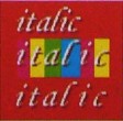
It is not clear from the illustration if decoders are supposed to be able to letterspace type by themselves. Wouldn’t the top row have been a better example for multiple background colours?
Also, while foreground and background colours can be individually altered for each bounding box, we are also told that “font design with a complete frame of bg colour surrounding the fg colour character pixels” is permitted. The spec does not say how to create a font file with built-in colour values for foreground and background. It is not clear that the authors understood what they were permitting.
Character edging
The edges of characters can be set by the user – none, right drop shadow, raised, depressed, or uniform (outline). We are told that such designations “follow... a convention commonly used by industry,” though it’s not clear what industry.
Semantic coding of caption text
Of great interest is the ability to mark up caption text according to its actual semantics. It appears that any individual string of text within a window can be defined or redefined. This is a tremendously useful feature that will, presumably, never be used.
The semantics of these “caption-text function tags” are:
- Dialogue (the default; caption viewers may not define font features for this tag)
- Source or speaker ID
- Electronically-reproduced voice
- Second-language dialogue
- Voiceover
- Dubbing
- Subtitling
- Voice quality
- Song lyrics
- Sound effects
- Music description
- Expletive (optionally undisplayed)
Three slots are undefined, and another code is available for “text not to be displayed.”
Conclusions
Like so many other specifications, 708 is underspecified. It turns high-definition television into a set of overlapping coarse grids. Its understanding of actual typography is minimal at best and urgently needs to be revised (to CEA-708-D) with the aid of actual typographers.
Version history
- 2006.11.29
- Posted.