Ancient BBC ‘subtitling’ font revealed
We have made reference, from time to time, to a mysterious BBC slabserif “subtitling” font in use since the 1970s. It became ridiculous that we did not know even the name of the font despite writing about it since 1989, so we asked around – and actually got a response.
Richard Southall, author of the recent Printer’s Type in the Twentieth Century, writes:
I designed the font at Reading when I was teaching there, in collaboration with Alison Masters (one of the students in the department). The work was done between 1975 and 1977. The subtitle generator with which the font was used was the Screen Electronics CGM-100. This was a digital machine (unlike the BBC’s “Anchor” machine that preceded it) and was the first of its kind to have a 64 MHz clock rate.
This meant that our design grid could have twice as much resolution in the horizontal as in the vertical direction, so that we could be reasonably subtle (within the technology’s limitations) with stroke weights and the shapes of vertically-running curves. The generator had a variable-rise-time facility for character edges, which allowed us to smooth out the stepped appearance of sloping lines to some extent.
The font was designed in the first instance for feature-film subtitling, though it soon found other uses. Its design was based (at many removes) on Rockwell Light, which had been used for some time in the traditional technique of movie subtitling on television. This involved making a second film, the same length as the feature, which carried only the subtitles. The two films were run in sync on two telecine machines, and the signals from the two machines were combined for broadcast. Running a multireel feature thus involved four machines (two each for alternate reels), and since the telecine area at BBC TV Centre only had five machines altogether, there was no redundancy. The Screen Electronics system was very welcome as a result. It also saved the BBC a stack of money, since there was no longer any need to make the films carrying the subtitles.
The font was called TKST (for TeleKine SubTitling: the BBC, being a stronghold of tradition, called the telecine area TK). It was followed by a condensed sansserif, made for the Dutch broadcasting organization NOS, and by a series of other designs including a Greek and a Cyrillic. My last design for Screen Electronics was completed just before I went to Stanford in the autumn of 1983. [...]
You might also be interested to look at “Character generator systems for broadcast television,” Information Design Journal, 2(1) (1981), which argues the case for direct design of screenfonts in usability-critical applications.
A mother lode, indeed a treasure trove, of information. But we aren’t done yet: Richard scanned us some slides.
-
-
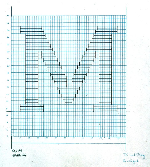
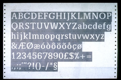
A finished production drawing for TKST. I don’t have an example to hand, but I guess the cap height was around 10 cm. The font was 34 lines high, with a bit of space above the caps to accommodate accents.
-
-
The very first trial pasteup, intended to be looked at from across the room. It turned out that this assessment technique, which I borrowed from type design for photocomposition, drastically overestimated the contrast of the final image and hence led us to space the font much too tightly in the first instance.
-
-
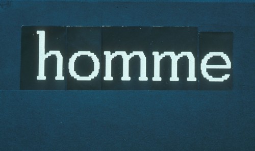
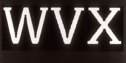
[This] illustrates a big problem in making the design. At this resolution, there is only a limited repertory of glitch-free slopes that can be produced. The trickery in converging junctions helps them to stay visually open, as well as assisting in fitting the characters to the relatively coarse width-allocation system (with only 16 different widths) that the generator used.
-
-
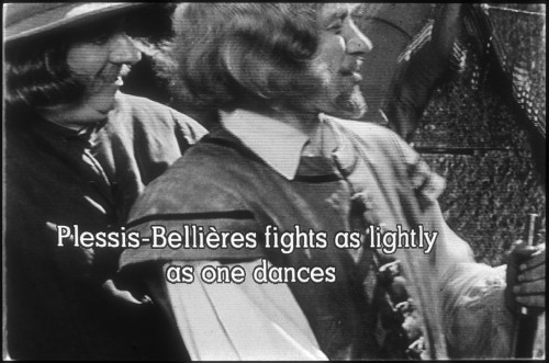
An early shot of the system’s output. (The movie was a French historical turkey called Angélique, marquise des anges.) It is a monochrome shot from a monitor in the TK production area, and consequently has much better picture quality than the viewer’s picture – on the other end of the transmission chain and a domestic-quality PAL decoder – would have. The black edging that makes the title visible in light areas of the picture caused all sorts of problems in transmission/reception, because the signal had to go from black almost to peak white in a very short time. The eventual solution was to use a “grey label,” made by reducing the brightness of the picture and killing the colour in a rectangle behind the title.
- (And really, isn’t the phrase «Plessis-Bellières fights as lightly as one dances» a punchline unto itself? Should we print that on the first Screenfont T-shirt?)
-
-
The last design I did for Screen Electronics, in the summer of 1983, on an early microcomputer system I built at the University of Reading.


Thanks
Our thanks go out to Richard for sharing these important historical documents. And note that TKST is still in use!
Version history
- 2005.04.26
- Posted.
Navigation
You were here: Screenfont.ca → Fonts → Today’s fonts →
Ancient BBC “subtitling” font revealed