Dispelling the myth of caption size
We’re now in our third decade of sitting by patiently as broadcasters, regulators, producers, and hearing people in general cook up any reason, any reason at all, not to provide captioning. Now, ten years after the Web was invented, online video is finally becoming popular and people are cooking up reasons not to make it accessible. A common complaint is that captions on online video “would be” too small to read.
Well, they’re not. And instead of discussing a hypothetical future in which online video carried captions, using that as a reason not to actually provide captions, we’ve got proof from actual video with captions.
Here’s a typical criticism, as found in a Newsweek article:
[An Apple] rep wrote: “Unfortunately, we face a large challenge incorporating legible text onto the iPod screens in a manner that does not consume the display in a disruptive fashion.”
An impressive display of assumptions and biases all compacted into one sentence.
- “Legible text” isn’t much of a problem (really legible text is, but we doubt we can get Apple to that point yet).
- We don’t know how captioning could “consume the display in a disruptive fashion”; it sounds like the “rep” considers the video image inviolable and considers any added text a sacrilege.
- It’s unclear how we could keep captioning from “consum[ing]” the display unless it were completely invisible, which, consistent with the previous point, seems to be what the “rep” obviously wants. Perhaps the “rep” would tolerate offscreen or out-of-frame display of captions, which may actually be possible even on iPods.
The Newsweek article itself dispells Apple’s claims: “[L]ots of people... intend to watch them on their computers or TVs – not on their tiny iPods. And many parts of Lost have [subtitles that] show up anyway.”
Summary
- Online video captions don’t have to be huge to be readable.
- Online video captions are usually the same relative height as captions in other media. And you’re watching the video from a closer distance.
- Size isn’t the problem.
Numerical estimates
We might as well use video iPods as a case here, since it seems to be the example everyone else uses. iPod Video screens are actually quite large as these things go – 320 × 240 pixels (H.264 format) or 480 × 480 pixels (MPEG-4). By comparison:
- A fullscreen NTSC DVD has a resolution of 720 × 480 pixels, and typical subpicture captions are 24 pixels high at cap height. 24 ÷ 480 = 1/20 screen height.
- Line 21 captions are 26 total lines high on a screen that’s 504 visible lines tall. 26 ÷ 504 ≈ 1/20 screen height.
- DVB pictures are commonly 544 × 576 pixels high, with 24-pixel-high captions (in, sadly, Tiresias most of the time). 24 ÷ 576 = 1/24 screen height.
- A previous source recommended that captions be 1/10 to 1/25 screen height (0.04 to 0.1). While the actual research basis of this declaration is open to question, all of the foregoing examples fall within that range.
By those proportions, iPod Video captions in the H.264 format could be anywhere from 10 to 24 pixels high to be of a size comparable to DVD and Line 21 captions. Move up to MPEG-4 and even captions at 1/25 screen height are 19 pixels high.
Viewing distance: Half an arm’s length
If TV is famously a lean-back medium and computers famously a lean-forward one, then handheld video is a scrunch-forward medium. You will probably hold your video iPod at half an arm’s length from your eyes, or hold it up in your lap, which again will be less than an arm’s length away. At those distances iPod screens are quite large enough to read. Unless you have a CrackBerry, your cellphone’s screen is smaller than that and you hold it at that distance to write or read a text message.
Even if you think – erroneously – that there aren’t enough pixels to play with, you need to weigh that against the fact that the screen is close to your eyes.
If you’re watching video on a computer, things change, but not by much. You’re still closer than if you were watching on a handheld player, and your video screen may be larger. (Even if you watch video at 2× resolution, leading to a grainy and pixelated image, player-generated captions may be the same size or may resize relatively smoothly without jaggies. In fact, this is an area that online players need to address.)
Real-world experience
Unlike Apple’s spokesperson, we don’t have to view this issue as a matter of theory (or of inchoate fears that captions will consume and disrupt the display). We can look at real-world examples, may of them derived from a previous project.
Reused Line 21 captions
In some respects, the ugliest possible option for online captioning is to simply decode TV closed captions and burn them into the picture. Such a thing was done most weekdays by CBC Newsworld from 2002 to 2004. (We earned a pittance of money setting that project up.) In that era, most news segments created by Newsworld itself were digitized and put online. What we added was a separate video file that placed a caption decoder upstream of the digitizing station, reasulting in Line 21 captions decoded and made permanently visible (i.e., open) in this second video file. If you wanted captions, you hit the CC symbol. If you didn’t, you hit the regular link.
And it worked pretty well.
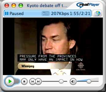
Those are 327 × 188–pixel images with visible captions 11 pixels high. Worse, they’re scrollup captions. Worse yet, the dots in each character’s original matrix do not perfectly map to pixels in the online video, causing characters’ component pixels to blur as they scroll. And they’re nearly all capital letters.
Despite all that, the captions are readable and do not consume or disrupt the screen. We expect that results would be similar for teletext captions burned into online video. And those are almost the worst-case scenario.
Other open captioning and subtitling
You can find screenshots of all the examples listed below at the other project page.
We found a few examples of open captioning and subtitling (in this case, meaning the fonts are burned into the video), with character heights comparable to other examples and with adequate readability.
We also found examples of player-generated captions (e.g., from SMIL or SAMI files that are associated with the video). In some cases, the authors set up these captions to play at all times, rendering them open captions. In others, you have to opt into them, making them closed captions.
Pay especial attention here to the use of offscreen or out-of-frame captions, which may not be entirely viable on an iPod, since they would require shrinking the picture to a size most people would not accept. But for letterboxed video on an iPod screen, there’s an interesting option: Get rid of the upper letterbox band, shift the whole video image upward so the lower letterbox band is twice as tall, and use all that space for captions. Some characters, or parts of characters, will still overlap the video image, but that will be minor in the grand scheme of things.
We are not suggesting that video continue to be available solely in uncaptioned form until somebody figures out how to do that letterboxing trick automatically. Deaf and hard-of-hearing people, and other captioning viewers, should not be made to wait. It is worth it to offend the sensibilities of people who hate captioning anyway – by plunking captions down onto the actual video image – if it means making video accessible. But this letterboxing option is one that could be investigated.
Version history
- 2006.06.15
- Posted.
Navigation
You were here: Screenfont.ca → Fonts → Today’s fonts →
Dispelling the myth of caption size